nood

Nood engaged us to relaunch its brand as the company expanded from IPL hair removal into the shaving and skincare categories. The objective was to elevate the brand beyond its prior expression, reimagining the existing identity with the presence and impact of a full rebrand. We developed a cohesive brand world across packaging, retail, digital, and campaign imagery, balancing science-driven credibility with warmth, sensuality and confidence.
Nood engaged us to relaunch its brand as the company expanded from IPL hair removal into the shaving and skincare categories. The objective was to elevate the brand beyond its prior expression, reimagining the existing identity with the presence and impact of a full rebrand. We developed a cohesive brand world across packaging, retail, digital, and campaign imagery, balancing science-driven credibility with warmth, sensuality and confidence.
Art Direction
Brand Identity
Campaigns
Brand Strategy
Packaging
Visual Merchandising

art direction
art direction
The photography direction was informed by an iconic 90’s sculptural approach to the human form, emphasizing clean composition, controlled contrast, and an almost architectural treatment of light and shadow. Sensuality emerged through restraint and form rather than provocation, creating visuals that feel timeless, poised, and quietly powerful.
Photographed by Lily and Lilac
The photography direction was informed by an iconic 90’s sculptural approach to the human form, emphasizing clean composition, controlled contrast, and an almost architectural treatment of light and shadow. Sensuality emerged through restraint and form rather than provocation, creating visuals that feel timeless, poised, and quietly powerful.
Photographed by Lily and Lilac


web design
web design
The website was designed as both a brand expression and an educational tool, clarifying how IPL works through a science-led lens. Interactive elements introduced a sense of play, while clear information architecture ensured education and product understanding remained central.
The website was designed as both a brand expression and an educational tool, clarifying how IPL works through a science-led lens. Interactive elements introduced a sense of play, while clear information architecture ensured education and product understanding remained central.
product art direction
product art direction
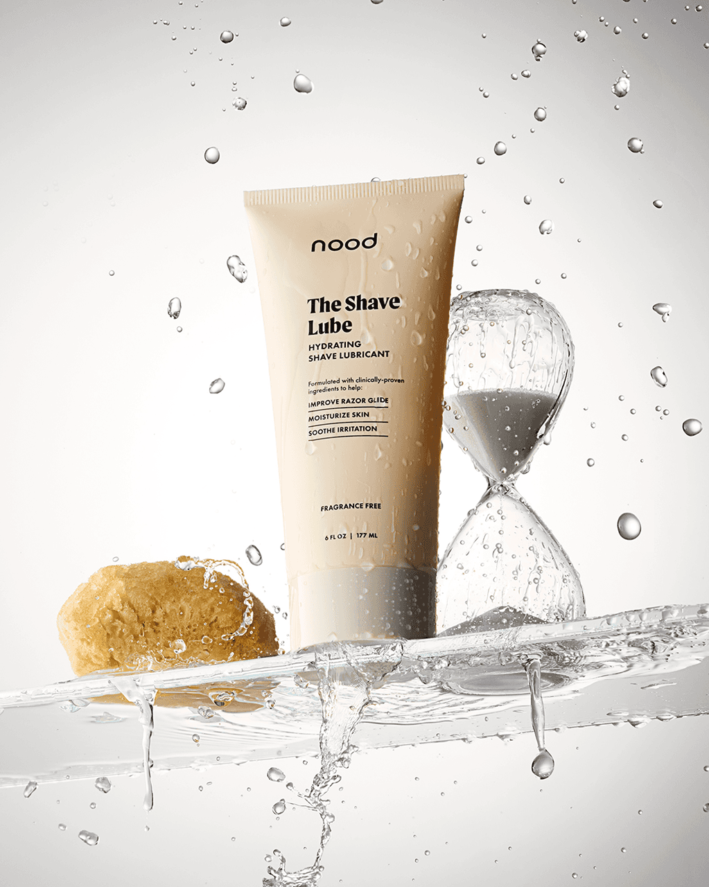
Inspired by Irving Penn’s minimalism, the product photography incorporates a heightened sense of motion, emphasizing texture, finish, and product integrity. The end result reflects the same sculptural sensuality established in the model photography.
Photographed by Daniel Cano. Styled by Betim Balaman
Inspired by Irving Penn’s minimalism, the product photography incorporates a heightened sense of motion, emphasizing texture, finish, and product integrity. The end result reflects the same sculptural sensuality established in the model photography.
Photographed by Daniel Cano. Styled by Betim Balaman


branding + packaging
branding + packaging
An intentional typography system, color palette, and clear hierarchy anchored the repackaging of Nood’s full product line. Consistency drove stronger recognition and brand cohesion. The result is packaging that feels approachable yet refined, and informative without feeling overwhelming.
An intentional typography system, color palette, and clear hierarchy anchored the repackaging of Nood’s full product line. Consistency drove stronger recognition and brand cohesion. The result is packaging that feels approachable yet refined, and informative without feeling overwhelming.

visual merchandising
visual merchandising
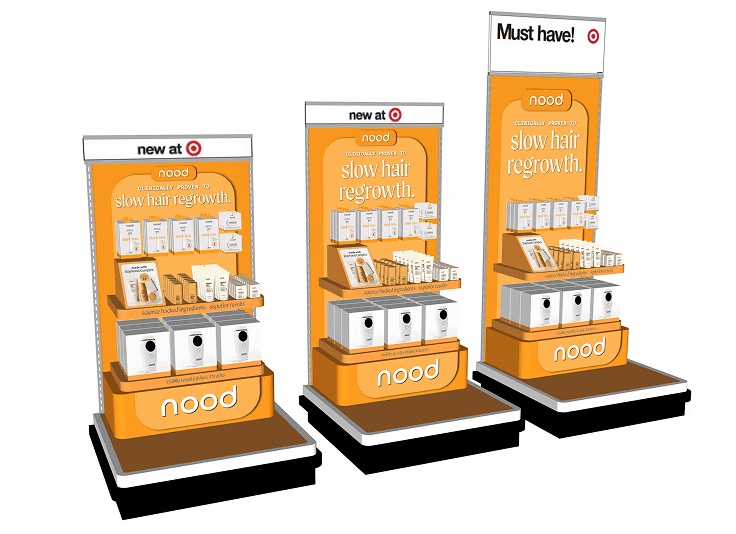
We designed and produced endcaps and in-line shelving for Nood’s initial retail launch at Target. Working within Target’s brand guidelines, the fixtures were customized to establish a distinct, ownable presence through Nood’s all-orange visual language. The result was a bold retail expression that maximized visibility and reinforced brand recognition at shelf.
We designed and produced endcaps and in-line shelving for Nood’s initial retail launch at Target. Working within Target’s brand guidelines, the fixtures were customized to establish a distinct, ownable presence through Nood’s all-orange visual language. The result was a bold retail expression that maximized visibility and reinforced brand recognition at shelf.

ooh advertising
ooh advertising
Shopify x Nood Holiday Season 2024
Shopify x Nood Holiday Season 2024

digital advertising + email
digital advertising + email
Paid ads embraced a more vibrant, attention-driven visual language, combining bold color and imagery to stand out within the channel, while email campaigns were designed to extend and reinforce the updated brand system.
Paid ads embraced a more vibrant, attention-driven visual language, combining bold color and imagery to stand out within the channel, while email campaigns were designed to extend and reinforce the updated brand system.


